Recap: Lecture 3 - DepMap Data Analysis
📦 Python Packages
Built-in Packages
- •
random: Generate random numbers - •
math: Mathematical functions - •
os: Operating system interface - • Import with
import package
PyPI Packages
- • Install with:
pip install package - •
pandas: Data analysis - •
numpy: Numerical computing - •
matplotlib: Data visualization
Object-Oriented Programming
- • Classes & Objects
- • Methods: functions within classes
- • Attributes: data within objects
🐼 Pandas DataFrames
Core Operations
- •
pd.read_csv(): Load data - •
df.head(): View first rows - •
df.shape: Get dimensions - •
df.columns: Column names
Data Selection
- •
df['column']: Select column - •
df.loc[row, col]: Label-based - •
df.iloc[i, j]: Position-based - • Boolean indexing:
df[df['col'] > 5]
Analysis Methods
- •
df.describe(): Summary statistics - •
df.sort_values(): Sort data - •
df.groupby(): Group analysis - •
df.corr(): Correlations
🧬 DepMap Cancer Dependency Analysis
What is DepMap?
Cancer Dependency Map: identifies which genes cancer cells need to survive
Gene Dependencies
Negative scores = essential genes; Positive scores = growth suppressing
Research Questions
Which genes are essential across cancer types? Cell-type specific dependencies?
🚀 Today: Explorative Data Analysis
Now that we can load and analyze data with pandas, we'll learn how to explore datasets systematically, create powerful visualizations, and understand the principles of effective data communication!
Vectorisation
EDA Techniques
Viz Principles
Matplotlib
Pandas Superpowers: NumPy & Vectorisation ⚡
Why pandas can analyze millions of data points in milliseconds
The Slow Way: Python Loops
Processing one item at a time
# Analyzing 1 million gene expression valuesgene_expression = [0.5, 1.2, 0.8, ...] # 1M values
# Loop through each valuenormalized = []for value in gene_expression: normalized.append(value * 2)
# ⏱️ Takes ~200ms❌ Problems:
- • Slow: Python loops are interpreted
- • One operation at a time
- • Can't use CPU parallelism
- • Memory inefficient
The Fast Way: Vectorised Operations
Operate on entire arrays at once
# Same 1 million gene expression valuesimport numpy as npgene_expression = np.array([0.5, 1.2, 0.8, ...])
# Vectorised operation - all at once!normalized = gene_expression * 2
# ⚡ Takes ~2ms - 100x faster!✅ Advantages:
- • Blazing fast: Written in C
- • Operates on entire arrays
- • Uses CPU SIMD instructions
- • Memory efficient
🧠 What is Vectorisation?
Array Operations
Apply operations to entire arrays without explicit loops
NumPy Backend
Pandas uses NumPy's C-optimized code under the hood
Big Data Ready
Handle millions of rows effortlessly in genomic datasets
🧬 Why This Matters for Biological Data
Real-world datasets:
- • DepMap: 1,000+ cell lines × 18,000+ genes
- • RNA-seq: Millions of reads per sample
- • Genomic variants: 3 billion base pairs
- • Microscopy: 100s of images, 1000s of cells
With vectorisation you can:
- • Normalize expression values instantly
- • Calculate statistics across all genes
- • Filter millions of variants in seconds
- • Analyze entire datasets interactively
Our Dataset: DepMap Gene Expression 🧬
Comprehensive gene expression profiles across hundreds of cancer cell lines
RNA-seq Expression Data
Log-transformed TPM Values
- • TPM: Transcripts Per Million
- • Normalizes for gene length & sequencing depth
- • Comparable across samples
- • Log-transformed for better statistics
Gene-Level Data
- • Unstranded RNA-seq measurements
- • Protein-coding genes only
- • Human genome (GRCh38)
- • ~18,000 genes measured
💡 Why log-transform?
Gene expression spans orders of magnitude. Log-transformation makes highly expressed and lowly expressed genes comparable.
Dataset Structure
Expression Matrix
# Pandas DataFrame structure:# GENE_1 GENE_2 GENE_3 ...# CELLLINE_1 5.2 2.8 0.1 ...# CELLLINE_2 4.9 3.1 0.3 ...# CELLLINE_3 6.1 2.5 0.0 ...# ...
# Rows: Cell lines (1000+)# Columns: Genes (18,000+)Rich Metadata
- • Cell line names: Official identifiers
- • Disease type: Cancer subtype
- • Lineage: Tissue of origin
- • Primary/Metastatic: Tumor source
🔬 About DepMap Expression Data
Cancer Cell Lines
1000+ immortalized cancer cell lines representing diverse cancer types
Research Questions
Which genes are highly expressed? What differs between cancer types?
🔍 What We'll Explore
Expression Distributions
Which genes are highly/lowly expressed across all cancers?
Cancer Type Comparison
How does breast cancer differ from leukemia?
Gene Co-expression
Which genes are expressed together?
Visualization Techniques
Create publication-ready plots to communicate findings
🎯 The Power of This Dataset
With over 18 million data points (1000+ cell lines × 18,000+ genes), we can discover patterns across cancer types, identify cancer-specific genes, and understand the molecular basis of different cancers - all with pandas & matplotlib!
Introduction to Exploratory Data Analysis 🔍
Understanding your data before diving into complex analyses
📋 The Two Essential Steps of EDA
Data Inspection
Know your data inside out
Data Visualization
See patterns and outliers
Step 1: Inspect with Pandas
Check Data Structure
# Load the datadf = pd.read_csv('expression_data.csv')
# How big is it?print(df.shape) # (rows, columns)
# What does it look like?df.head() # First 5 rowsdf.info() # Column types & memoryCheck Data Quality
# Any missing values?df.isnull().sum()
# Summary statisticsdf.describe() # mean, std, min, max
# Value rangesdf['expression'].min()df['expression'].max()Explore Categorical Data
# What categories exist?df['disease_type'].unique()
# How many of each?df.groupby('disease_type').size()
# Or use value_counts()df['lineage'].value_counts()Step 2: Visualize Patterns
Histograms
Distribution of a single variable
import matplotlib.pyplot as plt
# Expression distributionfig, ax = plt.subplots()ax.hist(df['gene_expression'], bins=50)ax.set_xlabel('Expression Level')ax.set_ylabel('Frequency')Scatter Plots
Relationship between two variables
# Gene A vs Gene Bfig, ax = plt.subplots()ax.scatter(df['BRCA1'], df['BRCA2'])ax.set_xlabel('BRCA1 Expression')ax.set_ylabel('BRCA2 Expression')Box Plots
Compare distributions across groups
# Expression by cancer typefig, ax = plt.subplots()df.boxplot(column='expression', by='cancer_type', ax=ax)ax.set_ylabel('Expression Level')💡 Why EDA is Critical for Biological Data
Catch Errors Early
Spot missing values, outliers, and data entry mistakes before analysis
Form Hypotheses
Discover unexpected patterns that lead to biological insights
Guide Analysis
Choose appropriate statistical tests based on data distribution
🎯 The EDA Mindset
Never run complex analyses without EDA first! Spend time understanding your data: What's the range? Are there outliers? What's the distribution? How do groups compare? These questions guide every successful data analysis project.
Data Inspection: Quality Control Checks 🔍
Essential pandas methods to understand your dataset before analysis
Load & Preview
# Load data from URL or filedf = pd.read_csv('expression_data.csv')
# First lookdf.head() # First 5 rowsdf.tail() # Last 5 rows✓ Check if data loaded correctly
Dataset Dimensions
# How big is the dataset?df.shape # (rows, columns)
# Example output:# (89, 17130)# 89 cell lines × 17,130 columns✓ Understand data scale
Data Types
# Check column typesdf.dtypes
# Detailed infodf.info()# Shows: memory usage, non-null counts# float64: numeric data# object: strings/categorical✓ Verify correct data types
Statistical Summary
# Summary stats for numeric columnsdf.describe()
# Shows for each column:# count, mean, std# min, 25%, 50%, 75%, max✓ Spot outliers & unexpected ranges
Missing Values
# Count NaN values per columndf.isnull().sum()
# Total missing valuesdf.isnull().sum().sum()
# Percentage missing(df.isnull().sum() / len(df)) * 100✓ Identify data gaps to handle
Categorical Data
# Unique values in categorydf['disease_type'].unique()
# Count of each categorydf['lineage'].value_counts()
# Number of unique valuesdf['cell_line'].nunique()✓ Understand categorical variables
📊 Our DepMap Expression Dataset
Shape
89 cell lines × 17,130 columns
Gene Expression
17,121 float64 columns
Metadata
9 object columns (categorical)
✅ Data Quality: Excellent
Only 1 NaN value in entire dataset (0.00%)
🎯 Practice These Checks!
Work through data inspection step-by-step with real DepMap expression data
The Power of GroupBy 🔢
Split-Apply-Combine: The fundamental pattern for grouped data analysis
📋 The Split-Apply-Combine Pattern
Split
Divide data into groups based on a category
Apply
Calculate statistics within each group
Combine
Merge results into a summary
Simple Example
Sample Data
import pandas as pd
# Create sample datasetdata = { 'name': ['Alice', 'Bob', 'Charlie', 'David', 'Eve'], 'team': ['A', 'B', 'A', 'B', 'A'], 'score': [85, 92, 78, 88, 95]}df = pd.DataFrame(data)
print(df)# name team score# 0 Alice A 85# 1 Bob B 92# 2 Charlie A 78# 3 David B 88# 4 Eve A 95🎯 Question:
What is the average score for each team?
GroupBy Solution
Group & Calculate
# Group by team and calculate meandf.groupby('team')['score'].mean()
# Output:# team# A 86.0# B 90.0# Name: score, dtype: float64What Happened?
1. Split: Divided by 'team' column
• Team A: Alice, Charlie, Eve
• Team B: Bob, David
2. Apply: Calculated mean score
• Team A: (85+78+95)/3 = 86.0
• Team B: (92+88)/2 = 90.0
3. Combine: Created summary
🧮 Common Aggregation Functions
.mean()
df.groupby('team')['score'].mean()Average per group
.sum()
df.groupby('team')['score'].sum()Total per group
.count()
df.groupby('team')['name'].count()Count per group
.size()
df.groupby('team').size()Group sizes
🎯 Multiple Statistics at Once
Using .agg()
# Multiple aggregationsdf.groupby('team')['score'].agg(['mean', 'min', 'max'])
# mean min max# team# A 86.0 78 95# B 90.0 88 92Different Stats per Column
# Different aggregations per columndf.groupby('team').agg({ 'score': ['mean', 'std'], 'name': 'count'})💡 Why GroupBy is Essential
GroupBy is your tool for comparative analysis: Compare cancer types, analyze by tissue lineage, find differences between conditions. Any time you need to ask "how do groups differ?", groupby is the answer!
Tidy Data Format 📋
The data structure that makes groupby and analysis easy
🎯 Three Rules of Tidy Data
Each variable is a column
One type of measurement per column
Each observation is a row
One complete record per row
Each value is a cell
Single value per cell
Wide Format (Not Tidy)
Hard to analyze with groupby
# Temperature measurements# Multiple values in columns
patient day1 day2 day30 Alice 36.5 37.2 36.81 Bob 37.0 37.5 37.12 Charlie 36.8 36.9 37.0😕 Problems:
- • Can't group by "day"
- • Multiple temperature columns
- • Variables (days) as column names
- • Difficult to plot time series
Long Format (Tidy)
Perfect for groupby & analysis
# Same data in tidy format# One observation per row
patient day temperature0 Alice 1 36.51 Alice 2 37.22 Alice 3 36.83 Bob 1 37.04 Bob 2 37.55 Bob 3 37.16 Charlie 1 36.87 Charlie 2 36.98 Charlie 3 37.0✨ Benefits:
- • Easy groupby:
df.groupby('patient') - • Each variable is a column
- • One temperature per cell
- • Simple to analyze & plot
🎯 Why Tidy Format is Essential
With Tidy Data You Can:
# Average temperature per patientdf.groupby('patient')['temperature'].mean()
# Average temperature per daydf.groupby('day')['temperature'].mean()
# Filter specific daysdf[df['day'] == 2]
# Plot easilyfig, ax = plt.subplots()ax.plot(df['day'], df['temperature'])Tidy data works seamlessly with:
- •
groupby()- Group by any variable - •
plot()- Direct visualization - • Boolean indexing - Easy filtering
- • Statistical functions - Clean aggregations
🔄 Converting Between Formats (Advanced)
Wide → Long: melt()
# Convert wide to tidydf_tidy = df.melt( id_vars=['patient'], var_name='day', value_name='temperature')Useful when you receive data in wide format
Long → Wide: pivot()
# Convert tidy to widedf_wide = df.pivot( index='patient', columns='day', values='temperature')Useful for creating summary tables
💡 For this course: Most biological datasets are already tidy or close to it. You'll rarely need melt() or pivot(), but it's good to know they exist!
💡 Remember
Tidy data = Easy analysis. When each variable is a column and each observation is a row, groupby, filtering, and plotting just work. If you're struggling with analysis, check if your data is tidy first!
GroupBy with Gene Expression Data 🧬
Applying groupby to real biological questions with DepMap data
Count Cell Lines per Lineage
Question:
How many cell lines do we have for each tissue type (lineage)?
Solution:
# Count cell lines per lineagedf.groupby('oncotree_lineage').size()
# Output:# oncotree_lineage# Blood 25# Breast 12# Lung 18# CNS/Brain 8# Skin 9# ...# dtype: int64Insight: We have good representation of blood cancers (25 lines) and lung cancers (18 lines) for comparisons!
Average Gene Expression by Lineage
Question:
What's the average BRCA1 expression in each cancer lineage?
Solution:
# Mean BRCA1 expression per lineagedf.groupby('oncotree_lineage')['BRCA1'].mean()
# Output:# oncotree_lineage# Blood 5.2# Breast 6.8# Lung 5.9# CNS/Brain 4.1# Skin 5.5# Name: BRCA1, dtype: float64Insight: Breast cancer cells show highest BRCA1 expression (6.8) - makes biological sense!
🎯 Advanced: Multiple Statistics with .agg()
Multiple Functions per Gene
# Get mean, std, and count for BRCA1df.groupby('oncotree_lineage')['BRCA1'].agg([ 'mean', 'std', 'count'])
# mean std count# oncotree_lineage# Blood 5.2 0.8 25# Breast 6.8 1.2 12# Lung 5.9 0.9 18# CNS/Brain 4.1 0.6 8Multiple Genes at Once
# Compare BRCA1 and TP53 expressiondf.groupby('oncotree_lineage')[ ['BRCA1', 'TP53']].mean()
# BRCA1 TP53# oncotree_lineage# Blood 5.2 7.1# Breast 6.8 6.9# Lung 5.9 7.8# CNS/Brain 4.1 6.2💡 Pro Tip: Use .agg() when you need multiple statistics or want to analyze several genes simultaneously!
🔬 Research-Grade Analysis
Different Stats per Gene
# Comprehensive analysisdf.groupby('oncotree_lineage').agg({ 'BRCA1': ['mean', 'std'], 'TP53': ['mean', 'std'], 'MYC': ['mean', 'std']})
# Creates multi-level columns:# BRCA1 TP53 MYC# mean std mean std mean std# oncotree_lineage# Blood 5.2 0.8 7.1 1.2 8.9 1.5# Breast 6.8 1.2 6.9 0.9 7.2 1.1Biological Questions You Can Answer:
- • Which lineage has highest gene expression?
- • Which cancer type shows most variability?
- • Are expression patterns consistent across types?
- • Which genes differentiate cancer lineages?
💡 GroupBy Unlocks Comparative Biology
Every comparative question uses groupby: "How does gene X differ between cancer types?", "Which tissue has highest expression?", "Are blood cancers different from solid tumors?" GroupBy is your tool for asking these questions!
📓 Practice Notebook
Try these examples yourself and explore more GroupBy operations!
The Power of Data Visualization 📊
Turning numbers into insights through visual communication
Complex Multi-Panel Analysis

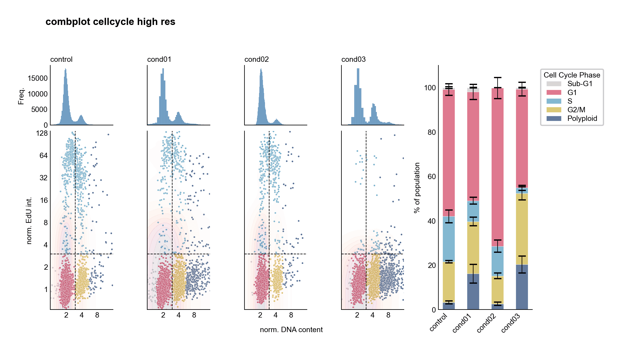
Cell cycle analysis: Histograms, scatter plots, and stacked bars reveal different aspects of the data
Comparative Stacked Bar Charts

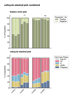
Stacked bars show proportions and statistical significance across experimental conditions
🎯 Why Data Visualization is Essential
See Patterns Instantly
Your brain processes visual information 60,000× faster than text. Spot trends, outliers, and relationships at a glance.
Reveal Hidden Insights
Distributions, correlations, and anomalies that are invisible in tables become obvious in plots.
Compare Across Groups
Quickly compare multiple conditions, time points, or experimental groups side-by-side.
Guide Statistical Analysis
Visualizations help you choose the right statistical tests by revealing data distributions and relationships.
Communicate Results
Figures are the universal language of science. A good plot tells your story better than paragraphs of text.
Quality Control
Catch data errors, batch effects, and technical artifacts before they ruin your analysis.
🛠️ Your Visualization Toolkit
Matplotlib
Python's foundational plotting library. Complete control over every element.
Seaborn
Beautiful statistical plots with minimal code. Built on matplotlib.
Pandas Plotting
Quick exploratory plots directly from DataFrames.
💡 Visualization First, Statistics Second
Always visualize your data before running statistical tests.A single plot can reveal what hours of statistical analysis might miss. In biology, understanding your data visually is not optional—it's essential for drawing correct conclusions and telling compelling scientific stories.
Understanding Data Types 📊
Different data types require different visualization approaches
🎯 Two Main Categories of Data
Continuous Data
Can take any value within a range
Discrete Data
Can only take specific, countable values
Continuous Data
Measurements on a continuous scale
Characteristics:
- • Can take any value in a range
- • Measured, not counted
- • Infinitely divisible (in theory)
- • Represented as decimals/floats
Biological Examples:
- • Gene expression: 5.234 TPM
- • Temperature: 37.5°C
- • Protein concentration: 2.8 mg/mL
- • Cell diameter: 12.3 μm
- • pH level: 7.42
Best plots: Histograms, scatter plots, line plots, box plots
Discrete Quantitative
Countable numerical values
Characteristics:
- • Whole numbers only
- • Counted, not measured
- • Cannot be subdivided
- • Still numerical
Examples:
- • Cell count: 1,000 cells
- • Number of mutations: 15
- • Chromosome number: 46
- • Colony count: 234
- • Gene copy number: 3
Best plots: Bar charts, count plots
Discrete Qualitative
Categories or labels
Characteristics:
- • Named categories
- • No numerical meaning
- • Can be ordered or unordered
- • Represented as strings
Examples:
- • Cancer lineage: Breast, Lung, Blood
- • Cell type: Neuron, Astrocyte, Glia
- • Treatment group: Control, Drug A, Drug B
- • Genotype: WT, Mutant, Knockout
- • Disease status: Healthy, Diseased
Best plots: Bar charts, box plots (grouped)
💡 Why Data Type Matters
🎨 Choose the Right Plot
Histograms for continuous, bar charts for categorical
📊 Statistical Tests
Different data types need different tests (t-test vs chi-square)
🔍 Data Cleaning
Identify errors when values don't match expected type
Essential Plot Types 📊
Choosing the right visualization for your data
Scatter Plot
Relationship between two variables
When to use:
- • Two continuous variables
- • Looking for correlations
- • Identifying outliers
- • Each point is an observation
Biological Examples:
- • Gene A vs Gene B expression
- • Cell size vs proliferation rate
- • Drug dose vs response
fig, ax = plt.subplots()ax.scatter(df['BRCA1'], df['TP53'])ax.set_xlabel('BRCA1 Expression')ax.set_ylabel('TP53 Expression')Line Plot
Trends over time or ordered sequence
When to use:
- • Time series data
- • Showing trends/changes
- • Connecting ordered points
- • Multiple groups over time
Biological Examples:
- • Cell growth over time
- • Gene expression during differentiation
- • Drug concentration in blood
fig, ax = plt.subplots()ax.plot(time_points, cell_count)ax.set_xlabel('Time (hours)')ax.set_ylabel('Cell Count')Bar Chart
Comparing categories or groups
When to use:
- • Categorical data
- • Comparing groups
- • Discrete counts
- • Clear group differences
Biological Examples:
- • Cell counts per tissue type
- • Mean expression by cancer lineage
- • Number of mutations per gene
fig, ax = plt.subplots()ax.bar(categories, values)ax.set_xlabel('Cancer Lineage')ax.set_ylabel('Mean Expression')Histogram
Distribution of continuous data
When to use:
- • One continuous variable
- • See data distribution shape
- • Check for normality
- • Identify skewness/outliers
Biological Examples:
- • Distribution of gene expression
- • Cell size distribution
- • Mutation frequency across genes
fig, ax = plt.subplots()ax.hist(df['BRCA1'], bins=30)ax.set_xlabel('BRCA1 Expression')ax.set_ylabel('Frequency')Box Plot
Compare distributions across groups
When to use:
- • Compare multiple groups
- • Show median, quartiles, outliers
- • Continuous data across categories
- • Compact distribution summary
Biological Examples:
- • Gene expression by cancer type
- • Cell viability across treatments
- • Protein levels in different tissues
fig, ax = plt.subplots()ax.boxplot([group1, group2, group3])ax.set_xticklabels(['Control', 'Drug A', 'Drug B'])ax.set_ylabel('Expression Level')Violin Plot
Box plot + full distribution shape
When to use:
- • Like box plot but more detail
- • Show full distribution shape
- • Reveal bimodal distributions
- • Multiple groups comparison
Biological Examples:
- • Cell cycle phase distributions
- • Expression patterns across lineages
- • Multimodal phenotype data
import seaborn as snsfig, ax = plt.subplots()sns.violinplot(data=df, x='lineage', y='BRCA1', ax=ax)🎯 Quick Decision Guide
One Variable:
Histogram (distribution) or Bar chart (categories)
Two Variables:
Scatter (correlation) or Line (trend over time)
Groups Comparison:
Box plot or Violin plot (show distributions)
Visual Aesthetics 🎨
Using visual properties to encode data dimensions
What are Aesthetics?
Aesthetics are visual properties (position, color, size, shape) that we map to data variables to communicate information. Each aesthetic channel encodes a different dimension of your data.
Position (x, y)
Most powerful aesthetic - use for key variables
Characteristics:
- • Most accurate perception
- • Two independent channels (x and y)
- • Best for continuous data
- • Primary way to show relationships
Biological Example:
Gene expression scatter plot
fig, ax = plt.subplots()ax.scatter(df['BRCA1'], df['TP53'])# x-position = BRCA1 expression# y-position = TP53 expressionColor
Add categorical or continuous dimensions
Two Types:
- • Categorical: Distinct hues for groups
- • Continuous: Color gradient for values
- • Draws attention effectively
- • 3-7 colors max for categories
Biological Example:
Color by cancer lineage
fig, ax = plt.subplots()for lineage in df['lineage'].unique(): subset = df[df['lineage'] == lineage] ax.scatter(subset['x'], subset['y'], label=lineage)ax.legend()Size
Encode magnitude or importance
Characteristics:
- • Best for continuous data
- • Shows relative magnitude
- • Can add a 3rd dimension
- • Avoid extreme size differences
Biological Example:
Bubble plot: size = cell count
fig, ax = plt.subplots()ax.scatter(df['gene_A'], df['gene_B'], s=df['cell_count']/10, alpha=0.6)# size encodes cell countShape
Distinguish categories (limit to 3-5)
Characteristics:
- • Only for categorical data
- • Harder to distinguish than color
- • Maximum 5-6 different shapes
- • Combine with color for clarity
Biological Example:
Different markers for treatment groups
markers = {'Control': 'o', 'Drug_A': 's', 'Drug_B': '^'}for treatment, marker in markers.items(): subset = df[df['treatment'] == treatment] ax.scatter(subset['x'], subset['y'], marker=marker, label=treatment)Line Width
Emphasize importance or magnitude
Characteristics:
- • Shows importance/weight
- • Can encode continuous data
- • Use subtle variations
- • Effective for network graphs
Biological Example:
Line thickness by confidence
fig, ax = plt.subplots()ax.plot(time, group_A, linewidth=3, label='High confidence')ax.plot(time, group_B, linewidth=1, label='Low confidence')Line Type
Distinguish categories in line plots
Characteristics:
- • Solid, dashed, dotted, dash-dot
- • For categorical groups
- • Maximum 3-4 different types
- • Combine with color
Biological Example:
Different line styles for conditions
fig, ax = plt.subplots()ax.plot(time, control, linestyle='-', label='Control')ax.plot(time, treated, linestyle='--', label='Treated')ax.plot(time, predicted, linestyle=':', label='Predicted')🎯 Aesthetic Effectiveness Hierarchy
Most Effective:
Position (x, y) - Use for your most important variables
Moderately Effective:
Color, Size - Good for adding dimensions
Less Effective:
Shape, Line type - Use sparingly, combine with color
Further Reading 📚
Excellent resources to deepen your data visualization skills

Fundamentals of Data Visualization
by Claus O. Wilke
Why read this:
- • Comprehensive guide to effective visualization
- • Principles of visual perception
- • Choosing the right plot type
- • Color theory and design principles
- • Available free online!

Data Visualisation: A Handbook for Data Driven Design
by Andy Kirk
Why read this:
- • Practical, hands-on approach
- • Design workflow and process
- • Real-world examples and case studies
- • Modern tools and techniques
- • Publication-ready visualizations
📖 More Learning Resources
Online Galleries
- • Python Graph Gallery
- • Seaborn Example Gallery
- • Matplotlib Examples
Interactive Tutorials
- • DataCamp courses
- • Kaggle Learn
- • Real Python tutorials
Scientific Examples
- • Nature Methods guides
- • Ten Simple Rules papers
- • Scientific plotting guides
Introduction to Matplotlib 📊
Python's foundational plotting library for scientific visualization
🎨 What is Matplotlib?
Publication Quality
Create figures ready for scientific papers and presentations
Highly Customizable
Control every aspect of your plots - colors, labels, fonts, sizes
Industry Standard
Foundation for Seaborn, Pandas plotting, and many other libraries
⚡ Two Ways to Plot: Which Should You Use?
❌plt. API (MATLAB-style)
import matplotlib.pyplot as plt
# Quick but implicitplt.plot([1, 2, 3], [1, 4, 9])plt.xlabel('X values')plt.ylabel('Y values')plt.title('My Plot')plt.show()• Simpler for quick plots
• You'll see this in online tutorials
• Less control with multiple plots
• Implicit: modifies "current" figure
✅fig, ax API (Object-Oriented)
import matplotlib.pyplot as plt
# Explicit and powerfulfig, ax = plt.subplots()ax.plot([1, 2, 3], [1, 4, 9])ax.set_xlabel('X values')ax.set_ylabel('Y values')ax.set_title('My Plot')plt.show()• Explicit: you control each axes
• Essential for multi-panel figures
• Professional standard
• More powerful and flexible
🎯 In this course, we use ONLY the fig, ax API
It's more powerful, explicit, and the professional standard for scientific plotting
📄 Figure (fig)
The entire canvas - like a blank piece of paper
- • Controls overall size
- • Contains one or more axes
- • Saves to file
- • Sets background color
# Create figurefig, ax = plt.subplots(figsize=(8, 6))
# Save figurefig.savefig('my_plot.png', dpi=300)📊 Axes (ax)
The plot area - where your data lives
- • Contains the actual plot
- • Has x-axis and y-axis
- • You do most work here
- • Multiple axes per figure
# Plot on axesax.plot(x, y)ax.scatter(x, y)ax.set_xlabel('Gene Expression')ax.set_ylabel('Cell Viability')🚀 Your First Matplotlib Plot - Three Steps
1️⃣ Create Figure & Axes
fig, ax = plt.subplots()2️⃣ Plot Your Data
ax.plot(x, y)3️⃣ Customize & Show
ax.set_xlabel(...)📓 Practice Notebook
Learn matplotlib by creating your first biological plots!
Understanding Data with Histograms 📊
Visualizing data distribution - the first step in exploratory data analysis
📈 What is a Histogram?
Definition
A histogram shows the distribution of numerical data by dividing the range into bins and counting how many values fall into each bin.
Think of it as: Sorting all your data into buckets and seeing which buckets are full and which are empty.
What Histograms Reveal
- • Central tendency: Where most values cluster
- • Spread: How wide the distribution is
- • Skewness: Is data symmetric or skewed?
- • Outliers: Unusual values far from the rest
- • Modality: One peak or multiple peaks?
🎯 Creating Your First Histogram
Basic Histogram
import matplotlib.pyplot as pltimport pandas as pd
# Load gene expression datadf = pd.read_csv('expression_data.csv')
# Create histogram for one genefig, ax = plt.subplots(figsize=(8, 6))ax.hist(df['BRCA1'], bins=30, color='skyblue', edgecolor='black')ax.set_xlabel('BRCA1 Expression Level')ax.set_ylabel('Number of Cell Lines')ax.set_title('Distribution of BRCA1 Expression')plt.show()Key Parameters
- •
bins=30- Number of buckets to divide data into - •
color- Bar color - •
edgecolor- Border color around bars
💡 Tip: Try different bin numbers! Too few bins hide detail, too many create noise. Start with 20-50 bins.
🧬 Analyzing ALL Gene Expression with .flatten()
The Problem
Our DataFrame has many genes (columns). How do we look at the distribution of all expression values at once?
# Our data structure# BRCA1 TP53 MYC ...# Cell_Line_1 5.2 7.1 8.9# Cell_Line_2 6.8 6.9 7.2# ...
# We need all values as one array!The Solution: .values.flatten()
# Select only numeric gene columnsgene_cols = df.select_dtypes(include='number')
# Convert to numpy array and flatten to 1Dall_expression = gene_cols.values.flatten()
# Now plot ALL expression values!fig, ax = plt.subplots(figsize=(10, 6))ax.hist(all_expression, bins=50, color='lightcoral', edgecolor='black')ax.set_xlabel('Expression Level (All Genes)')ax.set_ylabel('Frequency')ax.set_title('Overall Gene Expression Distribution')plt.show()🔍 What .flatten() Does:
Step 1: .values
Converts DataFrame to numpy array (2D matrix)
Step 2: .flatten()
Collapses 2D array into 1D array
Result
Single array with all expression values!
🎨 Making Better Histograms
Add Transparency
# Overlay multiple distributionsfig, ax = plt.subplots()ax.hist(df['BRCA1'], bins=30, alpha=0.5, label='BRCA1', color='blue')ax.hist(df['TP53'], bins=30, alpha=0.5, label='TP53', color='red')ax.legend()ax.set_xlabel('Expression Level')Density Plot (Normalized)
# Show proportion instead of countfig, ax = plt.subplots()ax.hist(all_expression, bins=50, density=True, color='green', alpha=0.7)ax.set_xlabel('Expression Level')ax.set_ylabel('Density')ax.set_title('Normalized Distribution')💡 Histograms: Your First Look at Data
Always start with histograms! They reveal whether your data is normally distributed, has outliers, or needs transformation. In genomics, expression distributions guide normalization choices and help identify quality issues.
📓 Practice Notebook
Practice creating histograms with real gene expression data!
Creating Subplots for Comparisons 🎨
Compare multiple genes side-by-side using matplotlib subplots
🎯 Why Use Subplots?
Visual Comparison
Compare distributions side-by-side without overlapping
Publication Ready
Multi-panel figures are standard in scientific papers
Tell a Story
Show multiple aspects of your data in one figure
📊 Option 1: Side-by-Side Subplots (1 row, 2 columns)
Compare Two Genes Horizontally
import matplotlib.pyplot as plt
# Create 1 row, 2 columns of subplotsfig, axes = plt.subplots(1, 2, figsize=(12, 5))
# Left subplot: BRCA1axes[0].hist(df['BRCA1'], bins=30, color='skyblue', edgecolor='black')axes[0].set_xlabel('BRCA1 Expression')axes[0].set_ylabel('Frequency')axes[0].set_title('BRCA1 Distribution')
# Right subplot: TP53axes[1].hist(df['TP53'], bins=30, color='lightcoral', edgecolor='black')axes[1].set_xlabel('TP53 Expression')axes[1].set_ylabel('Frequency')axes[1].set_title('TP53 Distribution')
plt.tight_layout() # Prevent overlapplt.show()Key Points
- •
plt.subplots(1, 2)creates 1 row × 2 columns - •
axes[0]is the left plot - •
axes[1]is the right plot - •
figsize=(12, 5)makes it wider
💡 Always use tight_layout()! It automatically adjusts spacing to prevent labels from overlapping.
📊 Option 2: Stacked Subplots (2 rows, 1 column)
Compare Two Genes Vertically
# Create 2 rows, 1 column of subplotsfig, axes = plt.subplots(2, 1, figsize=(8, 10))
# Top subplot: BRCA1axes[0].hist(df['BRCA1'], bins=30, color='skyblue', edgecolor='black')axes[0].set_xlabel('BRCA1 Expression')axes[0].set_ylabel('Frequency')axes[0].set_title('BRCA1 Distribution')
# Bottom subplot: TP53axes[1].hist(df['TP53'], bins=30, color='lightcoral', edgecolor='black')axes[1].set_xlabel('TP53 Expression')axes[1].set_ylabel('Frequency')axes[1].set_title('TP53 Distribution')
plt.tight_layout()plt.show()When to Stack Vertically?
- • When x-axes represent the same variable
- • To align plots for easier comparison
- • For time series or sequential data
- • When you have limited horizontal space
Pro Tip: Vertical stacking makes it easier to compare x-axis values across plots!
📊 Option 3: Grid Layout (2×2 for Four Genes)
Compare Four Genes
# Create 2x2 grid of subplotsfig, axes = plt.subplots(2, 2, figsize=(12, 10))
genes = ['BRCA1', 'TP53', 'MYC', 'EGFR']colors = ['skyblue', 'lightcoral', 'lightgreen', 'wheat']
# Loop through positionsfor i in range(2): for j in range(2): idx = i * 2 + j # Convert 2D to 1D index axes[i, j].hist(df[genes[idx]], bins=30, color=colors[idx], edgecolor='black') axes[i, j].set_xlabel(f'{genes[idx]} Expression') axes[i, j].set_ylabel('Frequency') axes[i, j].set_title(f'{genes[idx]} Distribution')
plt.tight_layout()plt.show()2D Indexing
# Access with [row, column]axes[0, 0] # Top-leftaxes[0, 1] # Top-rightaxes[1, 0] # Bottom-leftaxes[1, 1] # Bottom-rightUse 2D indexing when you create a grid: axes[row, col]
🔬 Advanced: Shared Axes for Better Comparison
Share X or Y Axes
# Share y-axis for direct comparisonfig, axes = plt.subplots(1, 2, figsize=(12, 5), sharey=True)
axes[0].hist(df['BRCA1'], bins=30, color='skyblue', edgecolor='black')axes[0].set_xlabel('BRCA1 Expression')axes[0].set_ylabel('Frequency')axes[0].set_title('BRCA1')
axes[1].hist(df['TP53'], bins=30, color='lightcoral', edgecolor='black')axes[1].set_xlabel('TP53 Expression')# No ylabel needed - shared with left plotaxes[1].set_title('TP53')
plt.tight_layout()plt.show()Flatten for Easy Looping
# Create 2x2 gridfig, axes = plt.subplots(2, 2, figsize=(12, 10))
# Flatten to 1D array for easy loopingaxes_flat = axes.flatten()
genes = ['BRCA1', 'TP53', 'MYC', 'EGFR']
for idx, gene in enumerate(genes): axes_flat[idx].hist(df[gene], bins=30) axes_flat[idx].set_xlabel(f'{gene} Expression') axes_flat[idx].set_title(gene)
plt.tight_layout()plt.show()💡 .flatten() converts 2D axes array to 1D for simpler iteration!
📝 Subplot Quick Reference
Common Layouts
# Side-by-sidefig, axes = plt.subplots(1, 2)
# Stackedfig, axes = plt.subplots(2, 1)
# 2x2 Gridfig, axes = plt.subplots(2, 2)
# 3x3 Gridfig, axes = plt.subplots(3, 3)Important Parameters
# Set figure sizefig, axes = plt.subplots(2, 2, figsize=(12, 10))
# Share y-axisfig, axes = plt.subplots(1, 2, sharey=True)
# Share x-axisfig, axes = plt.subplots(2, 1, sharex=True)
# Always use at the end!plt.tight_layout()💡 Subplots Make Comparisons Clear
Multi-panel figures are essential for biological data. Use side-by-side for direct comparisons, stacked for aligned x-axes, and grids for multiple conditions. Always use tight_layout() to ensure professional-looking figures ready for publications!
📓 Practice Notebook
Master creating multi-panel figures for comparing genes!
Exploring Relationships with Scatter Plots 🔍
Discover correlations between genes using scatter plots
📊 What is a Scatter Plot?
Definition
A scatter plot shows the relationship between two numerical variables. Each point represents one observation (in our case, one cell line).
Key insight: If two genes show a pattern (line or curve), they may be biologically related - maybe they work together in the same pathway or one regulates the other!
Anatomy of a Scatter Plot
🎯 Creating Your First Scatter Plot
BRCA1 vs BRCA2
import matplotlib.pyplot as plt
# Create scatter plotfig, ax = plt.subplots(figsize=(8, 6))
ax.scatter(df['BRCA1'], df['BRCA2'], alpha=0.6, s=50, color='skyblue', edgecolor='black', linewidth=0.5)
ax.set_xlabel('BRCA1 Expression', fontsize=12)ax.set_ylabel('BRCA2 Expression', fontsize=12)ax.set_title('BRCA1 vs BRCA2 Expression Across Cell Lines', fontsize=14, fontweight='bold')
# Add grid for easier readingax.grid(True, alpha=0.3, linestyle='--')
plt.tight_layout()plt.show()Key Parameters
- •
alpha=0.6- Transparency (0-1) - •
s=50- Point size - •
color- Point color - •
edgecolor- Point border - •
linewidth- Border thickness
💡 Tip: Use alphato see overlapping points better, especially with large datasets!
🧬 Strong Correlation: TSC1 vs TSC2
Genes in the Same Complex
# TSC1 and TSC2 form a protein complex# Expected: strong positive correlation!
fig, ax = plt.subplots(figsize=(8, 6))
ax.scatter(df['TSC1'], df['TSC2'], alpha=0.6, s=60, color='lightcoral', edgecolor='darkred', linewidth=0.5)
ax.set_xlabel('TSC1 Expression', fontsize=12)ax.set_ylabel('TSC2 Expression', fontsize=12)ax.set_title('TSC1 vs TSC2: Co-regulated Genes', fontsize=14, fontweight='bold')
ax.grid(True, alpha=0.3, linestyle='--')
plt.tight_layout()plt.show()Biological Context
TSC1 and TSC2 form the TSC protein complex, which regulates mTOR signaling - critical for cell growth.
Prediction: These genes should show strong positive correlation because cells that express one usually express the other to form functional complexes!
🔬 Discovery Tip: Unexpected correlations can reveal unknown biological relationships or shared regulatory mechanisms!
📊 Compare Multiple Relationships with Subplots
Side-by-Side Comparison
# Compare two gene pairsfig, axes = plt.subplots(1, 2, figsize=(14, 6))
# BRCA1 vs BRCA2axes[0].scatter(df['BRCA1'], df['BRCA2'], alpha=0.6, color='skyblue', edgecolor='black', linewidth=0.5)axes[0].set_xlabel('BRCA1 Expression')axes[0].set_ylabel('BRCA2 Expression')axes[0].set_title('BRCA1 vs BRCA2')axes[0].grid(True, alpha=0.3)
# TSC1 vs TSC2axes[1].scatter(df['TSC1'], df['TSC2'], alpha=0.6, color='lightcoral', edgecolor='darkred', linewidth=0.5)axes[1].set_xlabel('TSC1 Expression')axes[1].set_ylabel('TSC2 Expression')axes[1].set_title('TSC1 vs TSC2 (Strong Correlation)')axes[1].grid(True, alpha=0.3)
plt.tight_layout()plt.show()What to Look For
- • Positive slope: Both increase together
- • Negative slope: One increases, other decreases
- • No pattern: No relationship (independent)
- • Outliers: Unusual cell lines worth investigating
- • Clusters: Subgroups of cell lines
🎨 Advanced: Color by Category
Color by Cancer Type
# Color points by lineagefig, ax = plt.subplots(figsize=(10, 7))
# Get unique lineageslineages = df['oncotree_lineage'].unique()colors = ['red', 'blue', 'green', 'orange', 'purple']
for lineage, color in zip(lineages, colors): mask = df['oncotree_lineage'] == lineage ax.scatter(df[mask]['BRCA1'], df[mask]['BRCA2'], alpha=0.6, s=60, color=color, label=lineage, edgecolor='black', linewidth=0.5)
ax.set_xlabel('BRCA1 Expression', fontsize=12)ax.set_ylabel('BRCA2 Expression', fontsize=12)ax.set_title('BRCA1 vs BRCA2 by Cancer Type', fontsize=14)ax.legend(title='Cancer Lineage')ax.grid(True, alpha=0.3)
plt.tight_layout()plt.show()Why Color by Category?
- • Reveals tissue-specific patterns
- • Shows if certain cancer types cluster together
- • Identifies outliers within groups
- • Makes multi-dimensional data interpretable
🧬 Biological Question: Do breast cancer cell lines show different BRCA1/BRCA2 patterns than lung cancer lines?
💡 Scatter Plots Reveal Hidden Relationships
Each point is a cell line - a biological observation. Strong correlations suggest genes work together in pathways or complexes. Scatter plots help you discover co-regulation, identify outliers, and form hypotheses about gene function. Always ask: "What biological story does this pattern tell?"
📓 Practice Notebook
Explore gene correlations and discover biological relationships!
Comparing Groups with Box Plots 📦
Visualize gene expression distributions across cancer types
📊 What is a Box Plot?
Definition
A box plot (box-and-whisker plot) shows the distribution of data through five key statistics: minimum, Q1 (25th percentile), median (50th percentile), Q3 (75th percentile), and maximum.
Perfect for: Comparing distributions across multiple groups - like comparing BRCA1 expression in breast vs lung vs blood cancers!
Anatomy of a Box Plot
🎯 Creating Your First Box Plot
BRCA1 Expression by Cancer Type
import matplotlib.pyplot as plt
# Prepare data for box plot# Group by cancer lineagedata_to_plot = [ df[df['oncotree_lineage'] == lineage]['BRCA1'] for lineage in df['oncotree_lineage'].unique()]
# Create box plotfig, ax = plt.subplots(figsize=(10, 6))
bp = ax.boxplot(data_to_plot, labels=df['oncotree_lineage'].unique(), patch_artist=True, notch=True, showmeans=True)
# Customize colorsfor patch in bp['boxes']: patch.set_facecolor('skyblue') patch.set_alpha(0.7)
ax.set_xlabel('Cancer Type', fontsize=12)ax.set_ylabel('BRCA1 Expression', fontsize=12)ax.set_title('BRCA1 Expression Across Cancer Types', fontsize=14, fontweight='bold')ax.grid(True, alpha=0.3, axis='y')
plt.xticks(rotation=45, ha='right')plt.tight_layout()plt.show()Key Parameters
- •
patch_artist=True- Enables coloring - •
notch=True- Shows confidence interval around median - •
showmeans=True- Displays mean as well as median - •
labels- X-axis category names
💡 Tip: Rotate x-axis labels withplt.xticks(rotation=45)when you have many categories!
🐼 Easier Method: Pandas Built-in Boxplot
One-Line Boxplot
# Pandas makes it super easy!fig, ax = plt.subplots(figsize=(10, 6))
df.boxplot(column='BRCA1', by='oncotree_lineage', ax=ax, patch_artist=True, grid=False)
# Clean up the automatic titleax.set_title('BRCA1 Expression Across Cancer Types', fontsize=14, fontweight='bold')ax.set_xlabel('Cancer Type', fontsize=12)ax.set_ylabel('BRCA1 Expression', fontsize=12)
# Remove the automatic suptitleplt.suptitle('')
plt.xticks(rotation=45, ha='right')plt.tight_layout()plt.show()Why Use Pandas Boxplot?
- • ✅ Much simpler syntax
- • ✅ Automatically groups data
- • ✅ No need to prepare data lists
- • ✅ Works directly with DataFrame columns
- • ✅ Perfect for quick exploratory analysis
🚀 Pro Tip: Use pandas boxplot for exploration, matplotlib boxplot for publication-quality customization!
📊 Compare Multiple Genes with Subplots
Side-by-Side Comparison
# Compare BRCA1 and TP53 across cancer typesfig, axes = plt.subplots(1, 2, figsize=(16, 6))
genes = ['BRCA1', 'TP53']colors = ['skyblue', 'lightcoral']
for idx, (gene, color) in enumerate(zip(genes, colors)): data_to_plot = [ df[df['oncotree_lineage'] == lineage][gene] for lineage in df['oncotree_lineage'].unique() ]
bp = axes[idx].boxplot( data_to_plot, labels=df['oncotree_lineage'].unique(), patch_artist=True, showmeans=True )
# Color the boxes for patch in bp['boxes']: patch.set_facecolor(color) patch.set_alpha(0.7)
axes[idx].set_xlabel('Cancer Type', fontsize=11) axes[idx].set_ylabel(f'{gene} Expression', fontsize=11) axes[idx].set_title(f'{gene} Across Cancer Types', fontsize=13, fontweight='bold') axes[idx].grid(True, alpha=0.3, axis='y') axes[idx].tick_params(axis='x', rotation=45)
plt.tight_layout()plt.show()What to Look For
- • Median differences: Which cancer type has highest/lowest expression?
- • Box height (IQR): Which group is most variable?
- • Overlapping notches: No significant difference if notches overlap
- • Outliers: Unusual cell lines for investigation
- • Whisker length: Data spread within each group
🧬 Biological Interpretation Guide
High BRCA1 in Breast Cancer?
Expected! BRCA1 is a tumor suppressor highly expressed in breast tissue. Compare median across cancer types.
Wide IQR = High Variability
Large boxes mean heterogeneous cell lines within that cancer type. Could indicate subtypes!
Outliers Are Interesting!
A breast cancer cell line with very low BRCA1? That's a potential BRCA1 mutation case!
💡 Box Plots: The Gold Standard for Group Comparisons
Box plots show distributions, not just means! They reveal whether groups truly differ, show variability within groups, and highlight outliers. Essential for comparing gene expression across cancer types, treatments, or time points. Always pair box plots with statistical tests to confirm visual differences are significant!
📓 Practice Notebook
Compare gene expression across cancer types with box plots!
Lecture 4: What We Covered 🎯
From data manipulation to visualization - your complete EDA toolkit
Part 1: Advanced Pandas
⚡Vectorisation
- • NumPy powers pandas operations
- • Avoid loops - use vectorized operations
- • 100-1000× faster than Python loops
📊GroupBy Operations
- • Split-Apply-Combine for group analysis
- •
.groupby()+.mean(),.agg() - • Essential for comparing cancer types
🗂️Tidy Data Format
- • Each variable = column
- • Each observation = row
- • Makes analysis simpler and consistent
Part 2: Exploratory Data Analysis
🔎Data Inspection
- •
.head(),.info(),.describe() - • Check for missing values and outliers
- • Understand data structure and types
📈Data Quality
- • Validate data ranges and distributions
- • Identify batch effects and artifacts
- • Catch errors before analysis
💡Pattern Discovery
- • Reveal relationships and trends
- • Form biological hypotheses
- • Guide statistical testing
Part 3: Scientific Visualization with Matplotlib
Core Concepts
# The fig, ax APIfig, ax = plt.subplots()ax.plot(x, y)ax.set_xlabel('X Label')ax.set_ylabel('Y Label')plt.tight_layout()plt.show()✅ Always use fig, ax approach - explicit and professional
Subplots for Comparisons
# Side-by-sidefig, axes = plt.subplots(1, 2)
# Stackedfig, axes = plt.subplots(2, 1)
# Gridfig, axes = plt.subplots(2, 2)Essential Plot Types
ax.hist(data, bins=30)ax.scatter(gene1, gene2)df.boxplot(column='gene', by='type')💡 Key Technique: Use .flatten()to analyze all gene expression values at once!
🚀 Your EDA Workflow Cheat Sheet
Step 1: Inspect
df.shapedf.head()df.info()df.describe()df.isnull().sum()Step 2: Analyze
# Group comparisonsdf.groupby('type')['gene'].mean()
# Use .agg() for multiple statsdf.groupby('type').agg(['mean', 'std'])Step 3: Visualize
# Distributionax.hist(df['gene'], bins=30)
# Relationshipax.scatter(df['g1'], df['g2'])
# Comparisondf.boxplot(column='gene', by='type')🎯 Key Takeaways
✅ Vectorization makes pandas fast - avoid loops!
✅ GroupBy enables group comparisons - essential for biology
✅ Always inspect before analyzing - catch errors early
✅ Use fig, ax API - professional matplotlib standard
✅ Three plot types cover most needs: histograms, scatter, box plots
✅ Visualization reveals patterns - always plot your data!
🧬 You now have the tools to explore and visualize biological data like a pro! 🎉
📓 Practice Notebooks
Apply what you've learned with hands-on exercises and real biological datasets
Practice vectorization, groupby, and data visualization with guided exercises